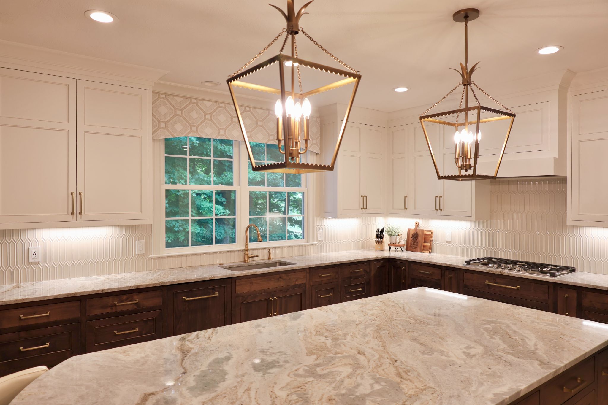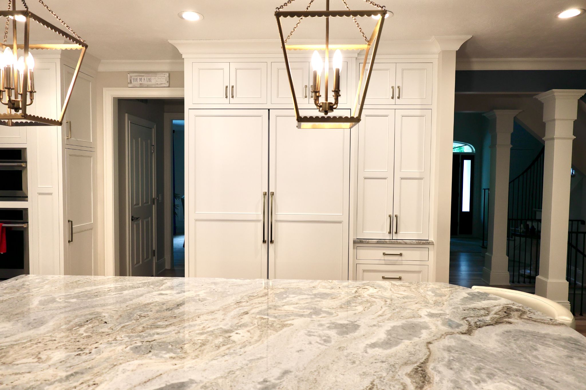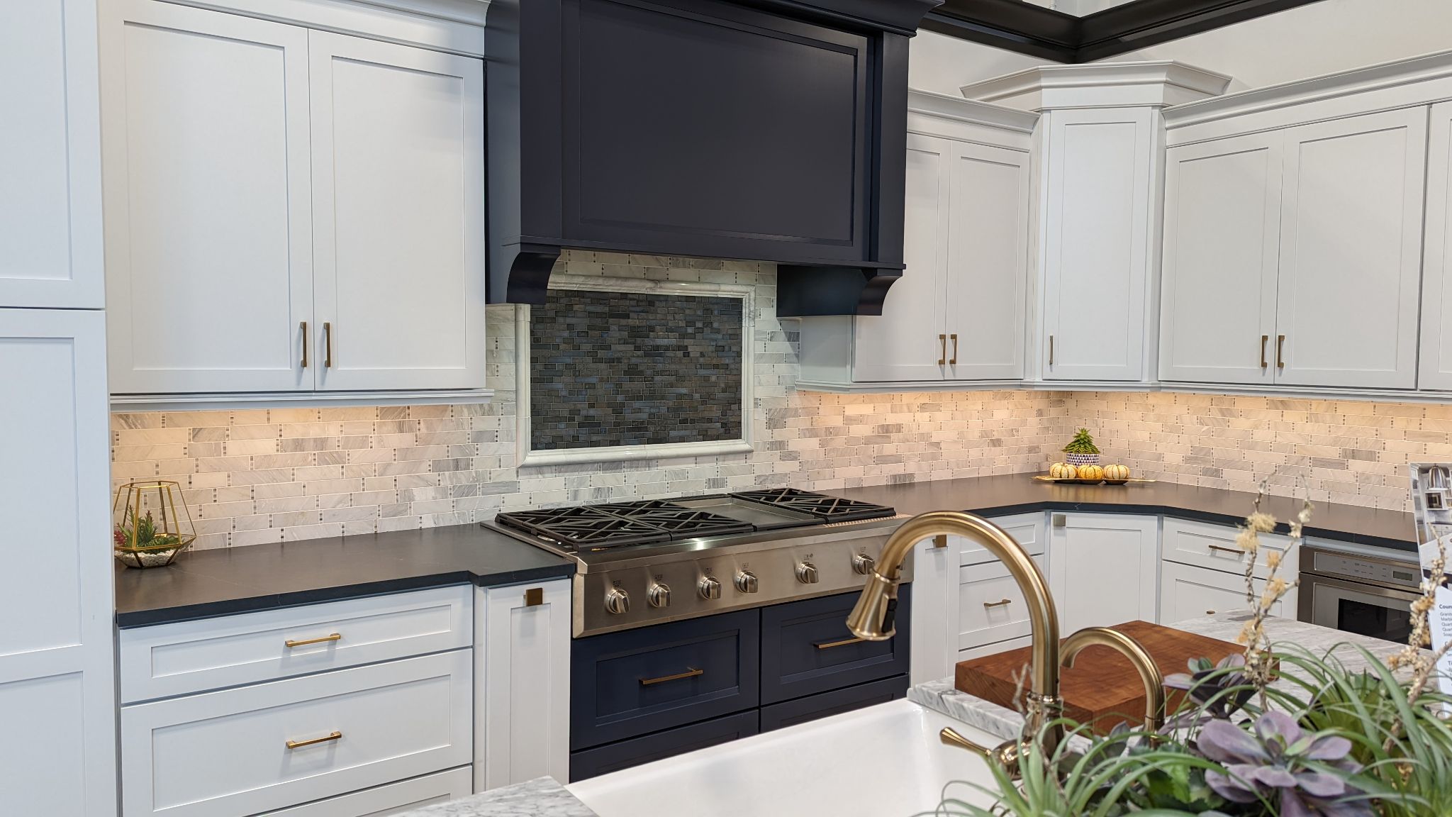
For your Cleveland Heights kitchen, a counter should make those existing choices feel intentional. A white that looks right online may feel cold beside the window casing. Compare these color families by undertone and movement, then test your shortlist in the light you’ll actually live with.
Countertop Colors for Traditional Kitchens: Four Useful Directions
Start with the overall color you want the countertop to contribute. Then inspect its undertone, the subtle warm or cool cast beneath that main color.
Warm White: This gives you a light surface without the sharp contrast of a blue-white background. Compare it beside existing trim, especially if that trim is already painted white. Two whites can make each other look unexpectedly yellow or gray.
Cream and Taupe: These colors can connect with warm woodwork and floors. Check how much yellow, pink, or brown appears across the slab. A sample that looks neutral on its own may feel much warmer once it covers the counter.
Soft Gray: Gray gives a traditional kitchen a quieter contrast when white feels too bright. Look closely at the undertone. A gray with a green or warm cast creates a different effect from one that leans blue.
Charcoal and Soft Black: Dark counters give the room a stronger horizontal line. They can sit comfortably beside substantial woodwork, but review how much dark surface the finished kitchen will show.
These classic kitchen countertop colors appear across different materials. Your color shortlist doesn’t settle the performance question. Use our countertop material guide to compare care needs once you know the appearance you want.
Let the Details You Keep Guide the Undertone
Replacing the counter is much easier to judge when the rest of the room gives you a reference.
In Cleveland Heights, “traditional” covers more than one kind of house. The city’s architectural resources describe varied home types. Your own interior gives you the most useful direction.
If you’re keeping warm wood floors and stained window trim, place a light counter sample beside both. A creamy background may connect them, while a cooler white creates a sharper contrast. Decide which effect you prefer before choosing a slab.
For a room with painted trim, compare the actual paint color. A white that seems neutral on a screen may look blue against it.
Look through the kitchen doorway as well. A counter visible from the dining room becomes part of that room’s view. Its color should feel considered from both sides.
Cabinet color belongs in this review, but it doesn’t need to drive every choice. The goal is a counter that relates to the home’s retained details, even if the cabinets will change later.
Compare Movement and Sheen in Your Own Light
Judge the surface from across the room before studying it up close. The background color may look quiet in a small sample, while larger veins make the full slab feel much more active.
For Cleveland Heights kitchen inspiration, save images that resemble your room’s level of detail. A counter photographed beside plain walls tells you less about how it will look against patterned flooring or shaped woodwork.
Use the images to identify what you like, then test actual surfaces:
- View the full slab to assess its main color and pattern.
- Review how the movement will fall across the planned counter.
- Compare available samples beside the finishes you’re keeping.
- Check them in daylight and under evening task lighting.
Sheen changes the result, too. A polished surface reflects light more sharply; a honed surface has a lower sheen. Review the actual finish because it affects how you see the color.
Honing doesn’t remove a stone’s care needs or prevent marble from etching.
Once the countertop direction is clear, review backsplash color and pattern. A quieter wall gives detailed stone more visual space. You can also compare the countertop edge profile against the room’s existing trim before finalizing the surface.
See Your Countertop Palette at Full Scale
Bring a photograph of your Cleveland Heights kitchen to Firenza’s Eastlake Design Center, including the view from the dining room. Add samples of retained finishes when you have them.
Our slab gallery lets you see the variation that a small sample leaves out. We can review the background color and movement with your room in mind, then discuss how the selected material fits your daily use.
Explore our countertop options and compare your shortlist before approving the surface. You’ll have a clearer basis for choosing the color your kitchen needs, without replacing the details you already enjoy.
Firenza serves Northeast Ohio and select surrounding areas. Contact our team to confirm availability for your project location.
Frequently Asked Questions
What Countertop Colors Work Best in a Traditional Kitchen?
Warm white, cream, soft gray, and charcoal all give you useful starting points. The right direction depends on the room’s retained finishes and how much contrast you want.
Light colors can reduce the visual weight of the countertop. Dark colors give it a stronger presence, which may suit a room with substantial architectural detail.
Neither approach works automatically. Compare the actual surface beside existing woodwork and look at the room from a distance, where you see the whole color relationship at once.
Can White Countertops Look Too Stark in an Older Home?
Yes. A bright or cool white can look sharp beside warm trim or aged wood. That doesn’t rule out white countertops; it means the particular white needs closer review.
Compare a warm white with a cooler option beside the same retained finish. Check both under the lighting you’ll use after installation.
If the warm white looks yellow, try a less creamy background. If the cool white makes the wood appear more orange, decide whether that contrast supports the room you want.
Do Dark Countertops Suit Traditional Kitchens?
Yes. Charcoal and soft black surfaces can suit traditional kitchens, including rooms with substantial woodwork. They create a distinct horizontal line that can make lighter surrounding surfaces more noticeable.
Look at the amount of dark color already present. Dark flooring, stained trim, and a deep counter together create more visual weight than any one element alone.
Test the balance in your room’s light. A dark sample placed on an otherwise bare table won’t show how the finished counter relates to those existing details.
Should Countertop Veining Match the Wood Grain?
The patterns should work comfortably together without needing to match. Strong grain and strong veining can both attract attention, so decide which surface you want to notice first.
If retained woodwork already carries a lot of movement, compare quieter stone before adding another prominent pattern. If the room’s other surfaces are restrained, more visible veining may provide the detail you want. Review the full slab and proposed layout because the pattern’s size and direction matter as much as its color.