How Color Trends Are Showing Up in the Home
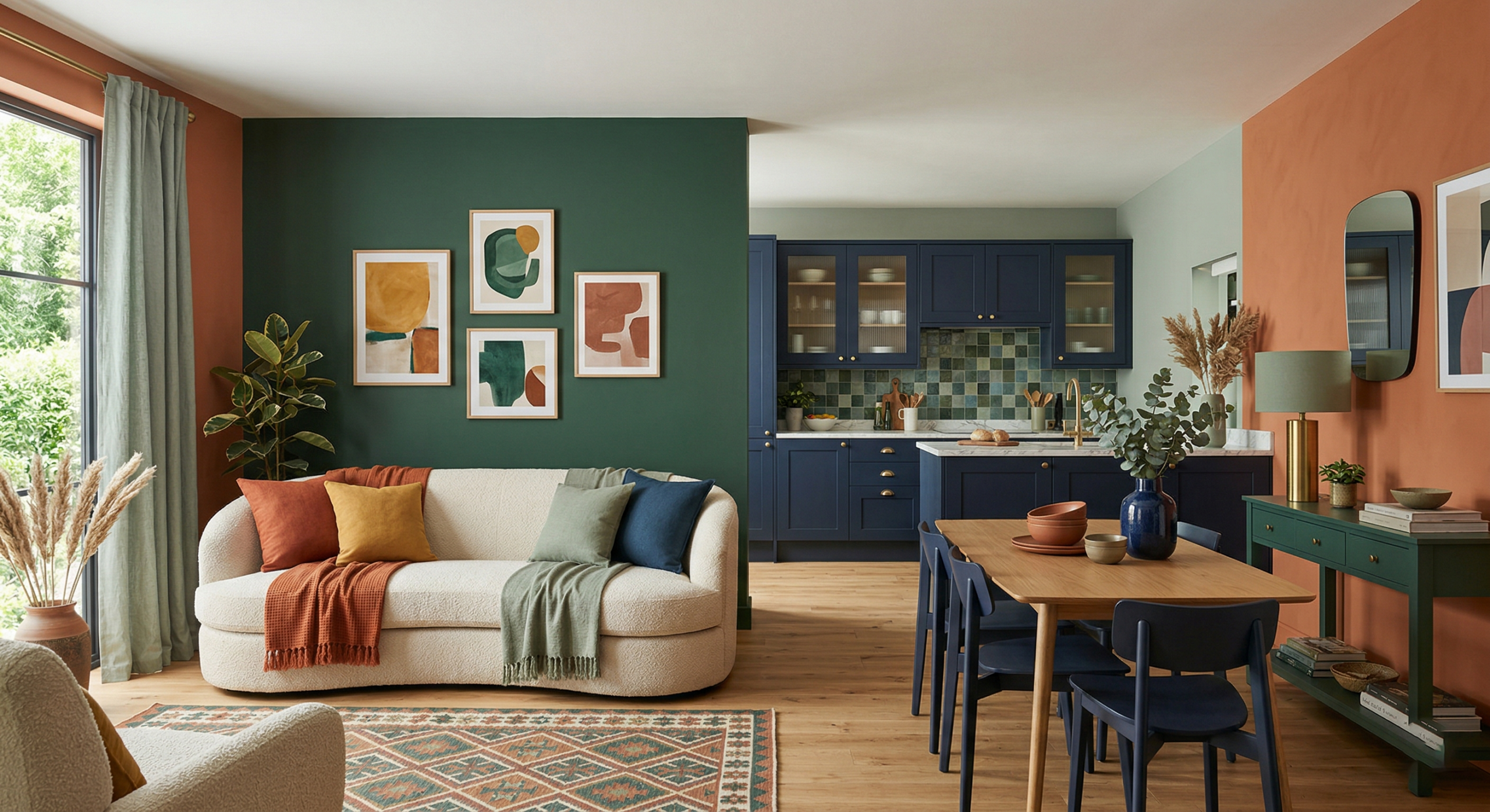
In 2026, interior color trends are showing up in more thoughtful and layered ways throughout the home. Instead of relying on one dominant shade, many spaces are combining colors across walls, cabinets, decor, and accent details to create a more natural and cohesive feel.
From warm earth tones and soft neutrals to deeper blues and greens, this year’s palette is less about following a single look and more about choosing colors that add warmth, contrast, and personality to the space.
That shift is also making color feel more flexible. Some homeowners may bring in a trend through painted cabinetry or decor, while others may use wall color or smaller accents to change the mood of a room.
This results in a more personal approach to color, with choices that feel livable, current, and connected to the way the home is used every day.
Six (6) Trending Interior Colors for 2026
The colors gaining attention are less about making a sharp statement and more about creating spaces that feel inviting, layered, and easy to live with.
1. Warm Earth Tones
Warm earth tones continue to stand out in 2026, especially shades like terracotta, clay, rust, sandstone, and olive-based neutrals. These earthy interior colors bring warmth and depth to a space while pairing naturally with wood, stone, and other organic textures. They work well in living areas, kitchens, and bedrooms where the goal is to create a grounded, welcoming feel.
2. Soft Neutrals with Character
Soft neutrals remain a major part of the conversation, but in 2026, they feel warmer and more expressive. Shades like creamy off-white, greige, taupe, and warm beige offer a more layered alternative to cooler neutrals. These colors work especially well as part of a whole-home palette because they bring subtle warmth and versatility without feeling flat or overly safe.
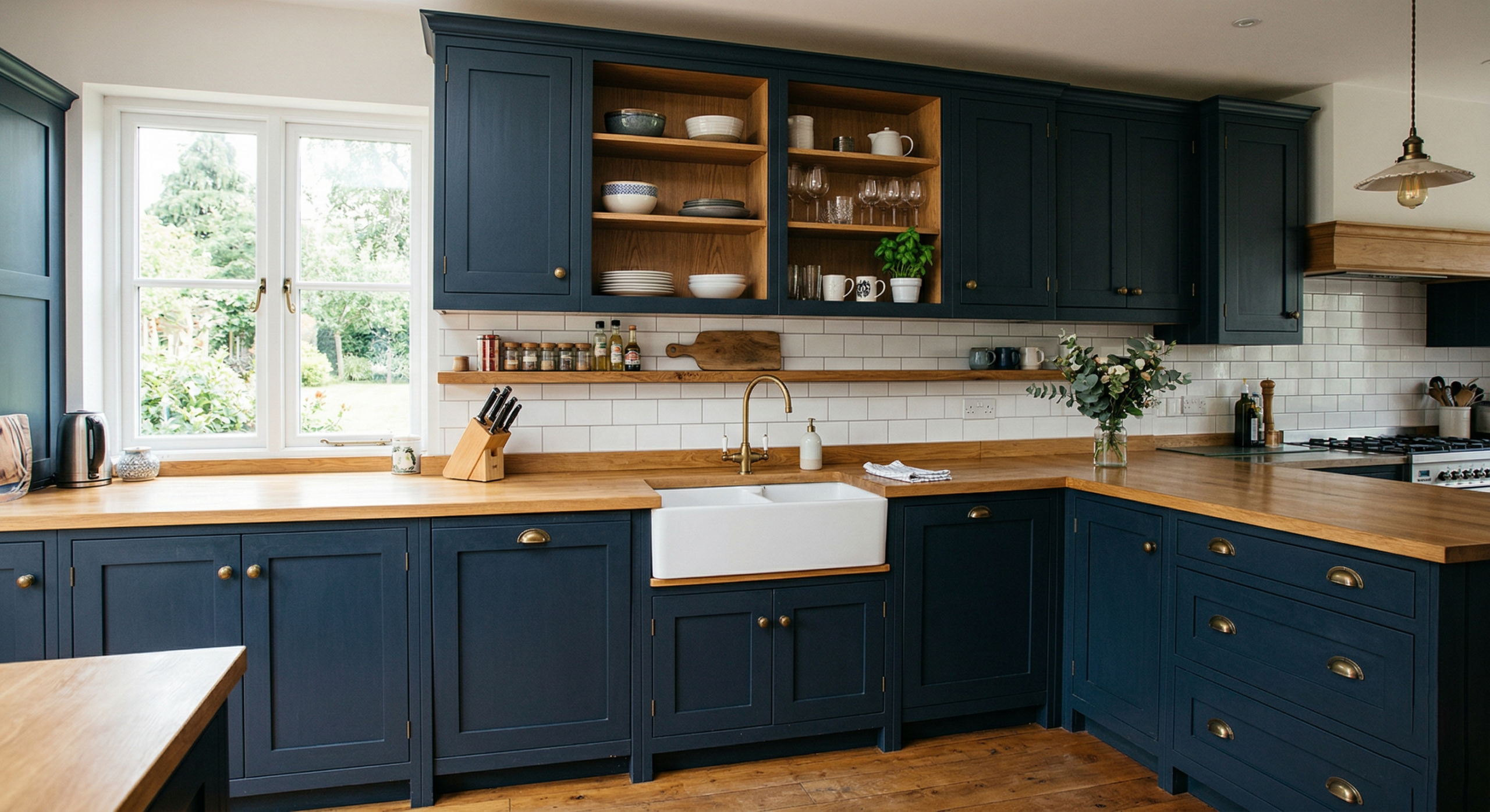
3. Moody Blues and Inky Shades
Moody blues and inky shades are continuing to show up in interiors that call for more depth and contrast. Navy, charcoal blue, and other saturated blue tones can add drama while still feeling refined and livable. These shades are especially effective on cabinetry, in dining rooms, or in offices where a darker color can create a strong but polished presence.
4. Sage and Dusty Greens
Sage and dusty greens remain some of the most versatile colors in the home. These muted green tones bring a calming, nature-inspired quality that works well across walls, cabinets, and accents. Whether used in kitchens, bathrooms, or living spaces, they help create a peaceful atmosphere and pair easily with wood tones, natural finishes, and soft neutral surroundings.
5. Black Accents and Bold Contrasts
Black is not necessarily the main color story in 2026, but it continues to play an important role in adding contrast and structure. Black accents can help define a space, whether they appear in trim, lighting, hardware, or two-tone cabinetry. Used thoughtfully, they create a grounded look and add visual clarity without overwhelming the room.
6. Peach, Apricot, and Blush
Peach, apricot, and blush tones are bringing a softer kind of warmth into interiors. These shades feel more refined than overly sweet, making them a useful option for decor, accent areas, or spaces that need a gentle lift in color. When used carefully, they can soften a room and introduce warmth and charm without taking over the design.
Taken together, these 2026 color trends point to interiors that feel more natural, more personal, and more balanced, with color being used to add warmth, contrast, and character throughout the home.
How to Incorporate 2026’s Interior Colors
Bringing color into the home does not have to mean committing to a full-room change right away. In many cases, the most effective way to use interior color trends is to introduce them gradually and build a palette that feels balanced, practical, and connected to the rest of the space.
- Start Small: One of the easiest ways to incorporate color at home is to begin in a smaller area. An accent wall, powder room, entryway, or other compact space can be a good place to test a new shade before using it more broadly. This approach makes color feel more manageable and can help homeowners get comfortable with a trend before applying it across a larger room.
- Layer Color: Color does not have to come from paint alone. A more layered color palette can be built through decor, including textiles, furniture, art, and accessories. This can create a more lived-in and flexible result, especially when the goal is to bring in warmth or contrast without making one surface do all the work.
- Balance Bold with Neutral: When using stronger colors, it often helps to balance them with softer neutrals. Pairing bold tones with light base colors, natural materials, or quieter finishes can keep the room feeling grounded. This kind of contrast allows color to stand out while still supporting a more cohesive overall design.
- Look Up: Ceilings are often overlooked, but they can be a useful place to bring in color in a subtle way. Painted ceilings can add interest, soften a room, or create a more finished feel, depending on the shade used. For homeowners who want to try something different, ceiling color can be an effective way to introduce a trend without changing every wall in the space.
Used thoughtfully, these ideas can make 2026’s color trends feel more approachable and easier to apply in a way that fits both the style of the home and how the space is used every day.
Final Thoughts
The interior color trends of 2026 reflect a growing preference for homes that feel warmer, more personal, and more connected to the materials and finishes around them. This year’s palette is less about following a look for the sake of trend and more about choosing colors that feel natural, comfortable, and right for the way a space is used.
As homeowners explore home color trends for walls, cabinetry, and decor, the most successful choices are often the ones that balance style with livability. Whether the goal is to refresh a room with softer tones or introduce more contrast through cabinetry and accents, the best colors for your home are the ones that support both the design and the feeling you want to create.
At Firenza, we help homeowners bring those decisions together with thoughtful guidance on cabinet color trends, finishes, materials, and overall design direction. Our team can help you choose colors and finishes that feel cohesive, practical, and true to your home.